Colours, patterns and textures
Application of colour, pattern and texture
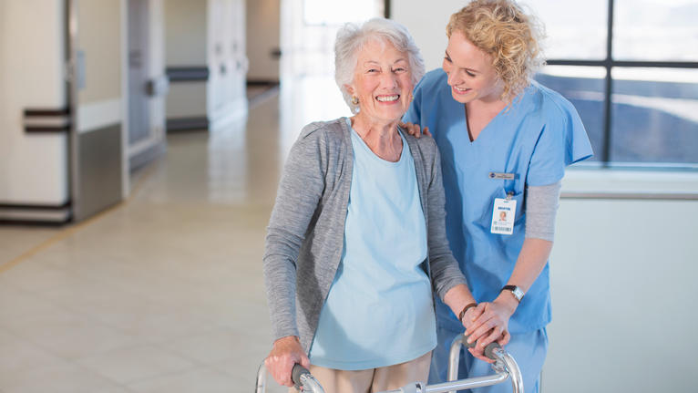
Colour, lighting and contrasts work together in creating the enjoyment of spaces and determining how comfortable people feel using it. They also contribute to the accessibility of an environment and in determining how safe and practical it is.
The practical applications of colour, pattern and texture are particularly important for healthcare flooring. For example, colour, patterns and texture can:
- Provide a cleaner appearance by making stains and marks less visible
- Create interiors that have a positive influence, e.g. healing, homely, stress-reducing
- Identify, unify or separate spaces to improve appearance and function
- Guide and orient for general or specific user profiles, e.g patients with dementia
Choosing the correct flooring colours depends on the audience and the space. For example, colours and patterns suitable for a patient bedroom or a corridor would be unsuitable for an operating theatre, which requires sharper visual contrasts to easily identify and recover dropped items such as small needles. Here however are some general principles:
- Although light colours are more reflective, they will also deteriorate more quickly and thus need to be replaced more often
- Dark colours can absorb downward lighting and alter the colour spectrum
- Bright colours show stains more than matt colours
Colour grading and contrasts for enhanced accessibility
70 to 75% of the information gathered by people is done through their vision. Therefore environments, facilities and products must be designed and managed to maximize the use of vision so that people will enjoy increased independence.
Colour grading can help people identify exactly where they are on their way, especially if they are following a long or uniform path. People also feel more spatially confident when there is bigger contrast. To do so, the Light Reflectance Value index (LRV) is used to calculate brightness contrast between two colours. A brightness contrast of at least 30% (or a 30-point variation) between the pathway and the surrounding floor is recommended. A difference of 60 points or more is recommended for danger signs and written information or logos.